Components - Navigation

Navigation

The navigations primary use is to help the viewer get to the page they would like on ChillerTV.com

Sitemap

AA new sitemap for ChillerTV.com will help the viewers navigate through the website. By keeping the pages in a similar hierarchy they will have no problem enjoying all the features the website has to offer. This will also make it easy to create additional content on any page of the website.
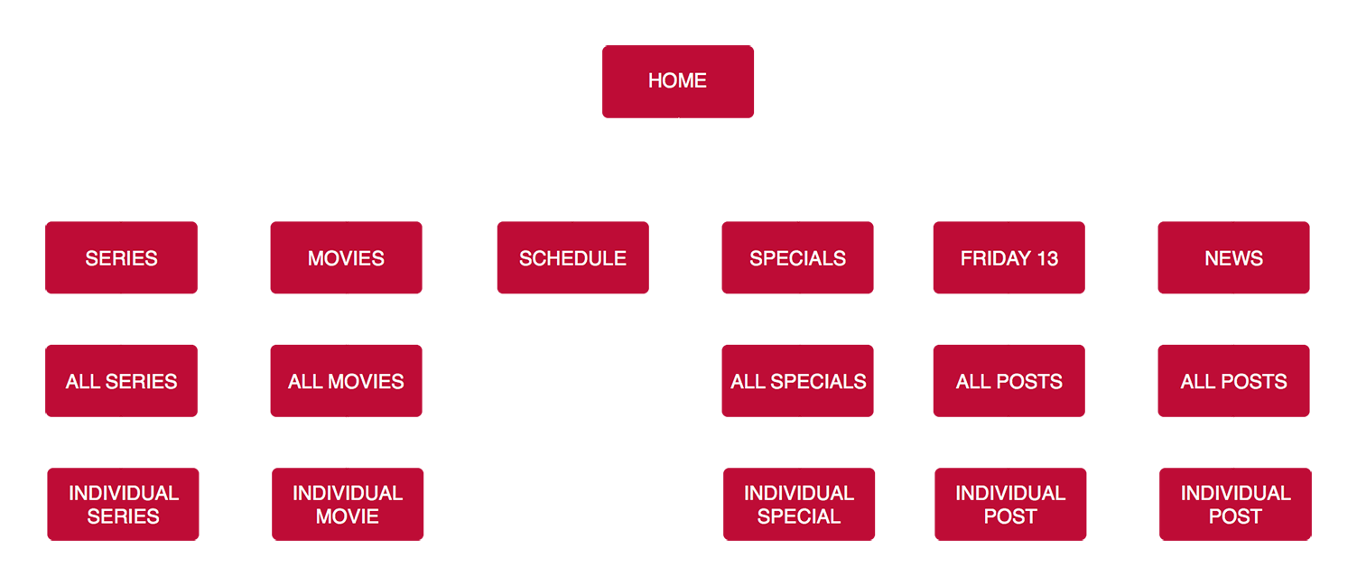
Sitemap

Navigation

In the initial view the navigation will be hidden with only a hamburger being shown.

Closed Navigation Example - Selected for Chiller

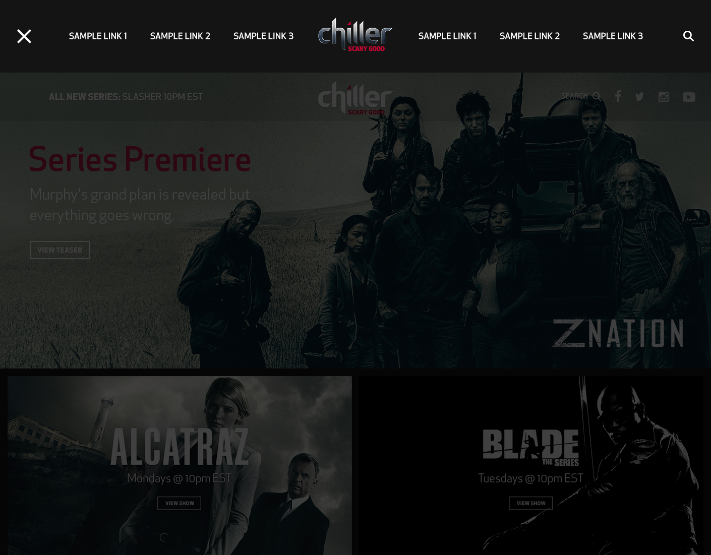
In this version, once the hamburger is clicked it will trigger a top panel to slide down and push the page down. This panel will contain 6-8 page links and a search option. In addition the hamburger will animate into an "X" which will close the navigation upon click. The navigation will also close if you click on the page anywhere out of the navigation area. This design is ideal if you have a limited amount of page links.

Top Navigation Example

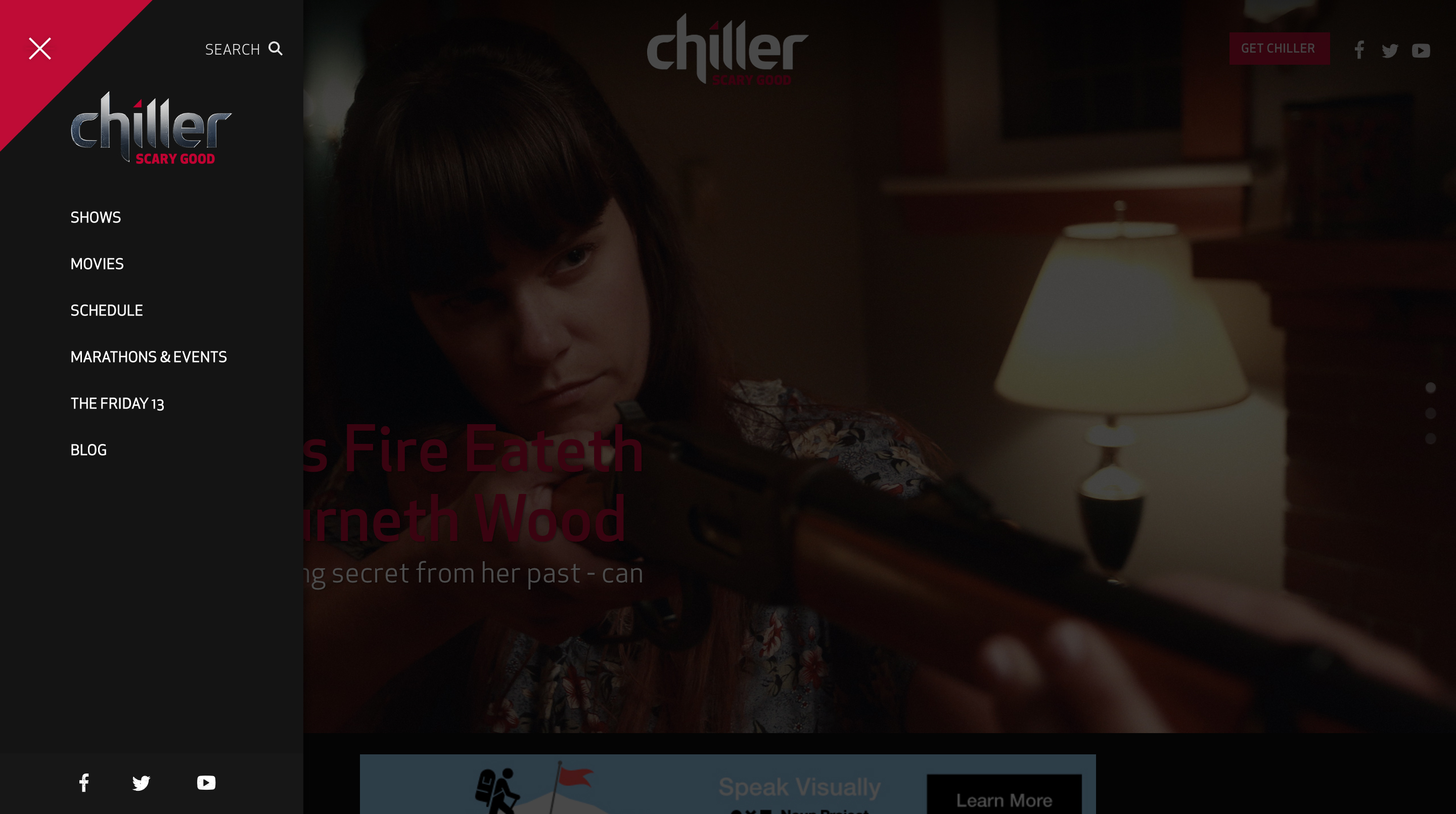
In the second version, once the hamburger is clicked it will trigger a side panel to slide left over the page content. This panel can contain an unlimited number of page links, a search option, and social media links. In addition the hamburger will animate into an "X" which will close the navigation upon click. The navigation will also close if you click on the page anywhere out of the navigation area. Keeping with the Chiller brand we will also include a slice in the top left corner, which not only is aesthetically pleasing, but also makes the "X" more apparent to the user.

This version of the navigation will function similarly to Syfy.com

Side Navigation Example - Selected for Chiller