Layout - Responsive UI

Responsive UI

The use of responsive ui is not only beneficial to the view, but to Chiller as well. By using responsive elements it will give the viewer a seamless experience across all devices and screen sizes. For users as Chiller, it will make it simpler and quicker to update content for all devices and screen sizes.

Breakpoints

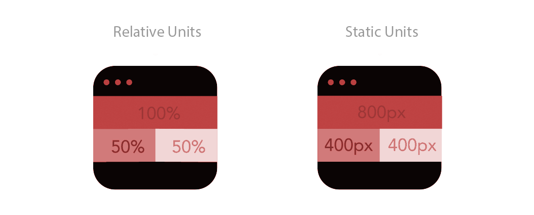
By utilizing responsive breakpoints the content and page flow will easily be maintained. Breakpoints will allow the layout of ChillerTV.com to change according to the viewers screen size and device. Breakpoints will also allow the control to hide and show elements depending on the viewers screen size.

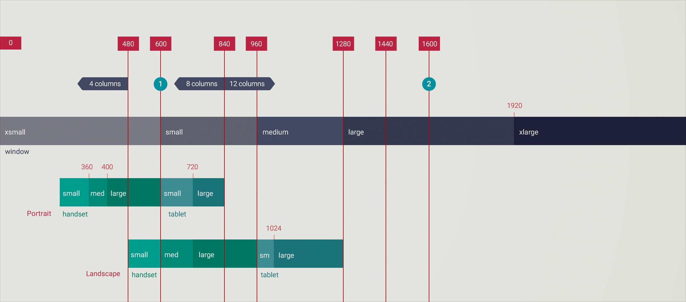
Breakpoint guidelines

Breakpoints example

Relative Units

Relative units will be used for both imagery and fonts to ensure readability on any device.

Relative units example

Flow

When screen sizes become smaller sections may increase in height, by using responsive eleements we are able to maintain the flow on ChillerTV.com and ensure there is no loss in information.

Flow example